Typography has always been something that has interested me, not quite sure why but I just find the fonts people use to represent themselves or their brand a really intriguing topic. Like what makes people want to write in capital letters or swirly lettering? What are they trying to say?
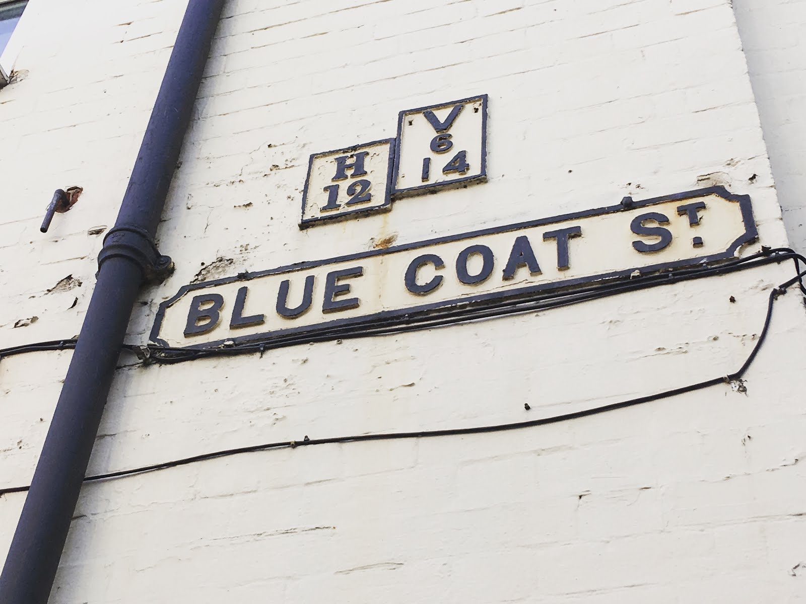
This week on my course we went on a mini field trip around Nottingham (well mainly the streets near the city campus), we were given the objective to take photographs of any typography that caught our eye on a range of levels (so up in the air, eye level & down on the ground). Surprisingly when you look around it's shocking just how many different types of type there is- ever since this activity I just can't stop noticing it. I guess that means the task got me brain really thinking about it.


If you know me well then you'll know that right now I'm having a bit of a yellow obsession... well I think to say to say a bit would be an understatement really. So it's pretty obvious I was gonna be drawn towards these images below.


It's weird because I've never noticed this tyre shop before yet I've walked down the road it's on so many times. For me this was the best find of the day I'm just obsessed with how it looks- it probably wasn't entirely planned out to look like this but I love the rustic feel to it. I don't know if the owners would allow it but I think it would be a really good shoot location- especially for fashion items. Images against the wooden walls or tyres would be very Instagram worthy. It's worth baring in mind anyway.

Green or khaki never used to be a colour I was attracted towards simply because despite it looking great on others it's just not a colour I would ever reach to wear. I never would have thought about putting white on green though- definitely something I want to experiment further with in my sketchbook. This font type below makes me think military- maybe that's the green background coming through but the way the numbers have been printed with gaps makes it feel very regimented and formal. Like it's not a casual font- it's bold, in your face and makes you want to almost obey what it's saying.


Normally when working I tend stick to black or other dark colours as my font colour simply because I think they're the colours that capture people's attention more. Boy how wrong I was. Bright colours such as red and pink or even yellow (sorry) with black make a eye catching combination worthy of a little mention. I think when it comes round to creating my business cards as part of the self promotion project later on this semester I want to try and not use black font just because I feel it's very standard and business cards need to represent you as a person- a standard font colour doesn't represent me.

I know we're on the topic of type but I want to quickly talk about illustrations, I have been always been a creative person, there was time back in high school where I wanted to become an illustrator. Over recent years though I kinda lost sight of my passion for it, this year I want to get back to doing more of it- I'm going to try and set myself the task of doing 3/4 quick illustrations a week drawing everything and anything that grabs my attention.


The irony of Peel Street peeling away *haha
Hope you've enjoyed this post.
What are your thoughts on typography? Is it something you notice?
Surely you must have thought about it at some point simply because it's all around us- it's unlikely you won't come across any form of typography every day of your lives. Even your phone font has been carefully considered...
Take Care & I'll see you all soon.
X
Image Credit: Own.
No comments
Post a Comment